Philosphy
We are KIING Studios, a multidisciplinary design studio where strategy, creativity, and precision redefine innovation. We partner with bold startups and global leaders to craft experiences that shape tomorrow.
Every project is an extension of our vision, and even at the start, we deliver world-class craftsmanship. Our portfolio, though driven by spec, is a testament to the ambition, rigor, and future-focused thinking we bring to every partnership.
Every project is an extension of our vision, and even at the start, we deliver world-class craftsmanship. Our portfolio, though driven by spec, is a testament to the ambition, rigor, and future-focused thinking we bring to every partnership.
01
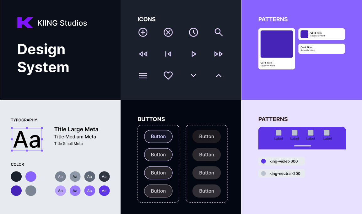
typography
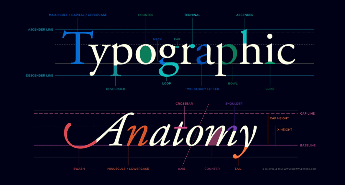
Typography
Text is the primary way users scan, understand, and complete tasks in KIING. Our typography system prioritizes clarity on dark UI, cross-platform consistency, and fast rendering by using a modern web font with strong system fallbacks.
Font stacks
We use a sans-serif stack for all UI and content, and a monospace stack for code, tokens, and technical strings.
Sans-serif (UI + content)
OS/ Platform
Font family
Windows
Inter
Segoe UI
Arial
macOS & iOS
SF Pro Text
SF Pro Display
Helvetica Neue
ChromeOS & Android
Roboto
Noto Sans
Linux (Ubuntu)
Ubuntu
DejaVu Sans
Linux (other)
Inter
system-ui
sans-serif
Fallback
system-ui
sans-serif
CSS
:root {
--king-font-sans: "Inter", system-ui, -apple-system, BlinkMacSystemFont,
"Segoe UI", Roboto, "Noto Sans", Ubuntu, "Helvetica Neue", Arial, sans-serif;
}
When to use
UI labels, navigation, buttons, forms
Headings, body copy
Marketing copy inside product surfaces
Monospace
OS/ Platform
Font family
Windows
JetBrains Mono
Cascadia Mono
Consolas
macOS & iOS
SF Mono
Menlo
ChromeOS & Android
Roboto Mono
Linux (Ubuntu)
Ubuntu Mono
DejaVu Sans Mono
Fallback
ui-monospace
SFMono-Regular
monospace
Monospace
OS/ Platform
Font family
Windows
JetBrains Mono
Cascadia Mono
Consolas
macOS & iOS
SF Mono
Menlo
ChromeOS & Android
Roboto Mono
Linux (Ubuntu)
Ubuntu Mono
DejaVu Sans Mono
Fallback
ui-monospace
SFMono-Regular
monospace
CSS
:root {
--kiing-font-mono: ui-monospace, "SFMono-Regular", "SF Mono", Menlo, Monaco,
"JetBrains Mono", "Cascadia Mono", Consolas, "Roboto Mono", "Ubuntu Mono",
"DejaVu Sans Mono", "Courier New", monospace;
}
When to use
Code blocks, terminal-style UI
Token values (hex, sizes, ids), logs, API keys (masked)
Type usage rules
Default UI font: var(--king-font-sans)
Default code font: var(--king-font-mono)
Weights (Inter): 400 (Regular), 500 (Medium), 600 (Semibold)
Avoid: 300 for UI on dark backgrounds (contrast feels weaker even if WCAG passes)
Numerals: enable tabular numerals for dashboards (optional)
CSS
.kiing-tabular {
font-variant-numeric: tabular-nums;
}
Suggested typography tokens
:root {
--king-text-body: 1rem; /* 16px */
--king-text-sm: 0.875rem; /* 14px */
--king-text-xs: 0.75rem; /* 12px */
--king-text-h600: 1.25rem; /* 20px */
--king-text-h700: 1.5rem; /* 24px */
--king-text-h800: 1.875rem; /* 30px */
--king-text-h900: 2.25rem; /* 36px */
--king-leading-body: 1.5rem; /* 24px */
--king-leading-tight: 1.25; /* unitless */
}
02
Text Size
Text Size Scale
Usage
Text sizes follow a clear hierarchy to ensure readability, accessibility, and fast visual parsing across complex interfaces. This scale is optimized for UI-first layouts, with optional long-form adjustments for content-heavy surfaces. Paragraph text is standardized at 1rem / 1.4 line-height to balance density and comfort.
Styles
Text size h900
Basic Properties
Font size: 2.25rem (36px)
Font weight: 500 / medium
Letter spacing: -0.02em
Color: king-neutral-900
UI properties
Line height: 2.5rem (40px)
Margin top: 3.25rem (52px)
Use for
Hero headlines
H1 (marketing-only)
Brand statements or campaign pages
(Not for core app UI pages)
Text size h800
Basic Properties
Font size: 1.875rem (30px)
Font weight: 500 / medium
Letter spacing: -0.015em
Color: king-neutral-900
UI properties
Line height: 2.25rem (36px)
Margin top: 2.5rem (40px)
Longform properties
Line height: 2.5rem (40px)
Margin top: 3rem (48px)
Use for
H1 (default)
Page titles
Feature introductions
Empty state
Text size h700
Basic Properties
Font size: 1.5rem (24px)
Font weight: 500 / medium
Letter spacing: -0.01em
Color: king-neutral-900
UI properties
Line height: 2rem (32px)
Margin top: 2.5rem (40px)
Use for
H2
Major page sections
Primary content groupings
Use once per major section
Text size h600
Basic Properties
Font size: 1.25rem (20px)
Font weight: 500 / medium
Letter spacing: -0.008em
Color: king-neutral-900
UI properties
Line height: 1.75rem (28px)
Margin top: 1.75rem (28px)
Long-form properties
Margin top: 2.25rem (36px)
Line height: 2rem (32px)
Use for
H3
Feature group titles
Section dividers within H2 blocks
Modal titles
Text size h500
Basic Properties
Font size: 1rem (16px)
Font weight: 500 / medium
Letter spacing: -0.006em
Color: Neutral-900
UI properties
Line height: 1.4rem (22px)
Margin top: 1.5rem (24px)
Long-form properties
Line height: 1.6rem
Margin top: 2rem (32px)
Use for
H4
Form sections
Card subsections
Dense UI groupings
Text size h400
Basic Properties
Font size: 0.875rem (14px)
Font weight: 600 / semibold
Letter spacing: -0.003em
Color: Neutral-800
UI properties
Line height: 1.25rem (20px)
Margin top: 1.25rem (20px)
Use for
Visually styled H4 (non-semantic) or <div>/<span>
Highlighted metadata labels
Inline section headers
Text size h300
Basic Properties
Font size: 0.75rem (12px)
Font weight: 600 / semibold
Letter spacing: 0.02em
Text transform: uppercase
Color: Neutral-700
UI properties
Line height: 1rem (16px)
Margin top: 1.25rem (20px)
Use for
Table headers
List group labels
Navigation group titles
Text size h200
Basic Properties
Font size: 0.75rem (12px)
Font weight: 600 / semibold
Letter spacing: 0
Color: Neutral-700
UI properties
Line height: 1rem (16px)
Margin top: 1rem (16px)
Use for
Secondary metadata
Minor UI headings
Helper group titles
Text size h100
Basic Properties
Font size: 0.6875rem (11px)
Font weight: 700 / bold
Letter spacing: 0.02em
Color: Neutral-600
UI properties
Line height: 1rem (16px)
Margin top: 1rem (16px)
Use for
Badges
Overlines
Status indicators
Paragraph
Basic Properties
Line height: 1.4em
Letter spacing: -0.01em
Color: Neutral-700
Font size: 1rem (16px)
Use for
<p>
Long-form content
Descriptions
02
Formatting
Color
KIING’s color system is built for dark-first UI with #030712 as the base canvas. Our tokens are designed to stay legible across product surfaces while meeting WCAG 2.2 contrast targets (AA minimum for text; AAA where practical). When you use tokens as intended (text on neutrals, accents via violet), the interface remains readable, premium, and consistent.
Primary color palettes
Neutral palette (core readability)
Neutrals power all default UI text, surfaces, borders, and elevation. On a dark base (#030712), neutrals establish hierarchy without relying on color.

Rule of thumb: Text lives in 50–500, structure lives in 600–700, surfaces live in 800–950.
Color Palette
Violet is KIING’s signature accent color used for brand identity, primary actions, and focused emphasis without sacrificing clarity on dark UI.

Groupings
For products that need more variety (charts, tags, categories), start with an 8-color base and expand only when needed:
8 colors (base)
default UI tags, simple charts
16 colors
dashboards, analytics views
24 colors
multiple categorical groupings
Extended colors
Use extended colors (success/warning/error/info) for system feedback only. Never use as a primary way to communicate meaning. Always pair with icons, labels, and/or helper text.
Color pairings
Every background color should ship with a recommended foreground token (text/icon) that passes contrast on #030712 (or on the surface it’s used on). If a team uses a color outside its intended pairing (e.g., violet as body text, or muted neutral on deep surfaces), they own the responsibility to re-check AA requirements.
02
Formatting
Color
KIING’s color system is built for dark-first UI with #030712 as the base canvas. Our tokens are designed to stay legible across product surfaces while meeting WCAG 2.2 contrast targets (AA minimum for text; AAA where practical). When you use tokens as intended (text on neutrals, accents via violet), the interface remains readable, premium, and consistent.
Primary color palettes
Neutral palette (core readability)
Neutrals power all default UI text, surfaces, borders, and elevation. On a dark base (#030712), neutrals establish hierarchy without relying on color.
Rule of thumb: Text lives in 50–500, structure lives in 600–700, surfaces live in 800–950.
Color Palette
Violet is KIING’s signature accent color used for brand identity, primary actions, and focused emphasis without sacrificing clarity on dark UI.
Groupings
For products that need more variety (charts, tags, categories), start with an 8-color base and expand only when needed:
8 colors (base)
default UI tags, simple charts
16 colors
dashboards, analytics views
24 colors
multiple categorical groupings
Extended colors
Use extended colors (success/warning/error/info) for system feedback only. Never use as a primary way to communicate meaning. Always pair with icons, labels, and/or helper text.
Color pairings
Every background color should ship with a recommended foreground token (text/icon) that passes contrast on #030712 (or on the surface it’s used on). If a team uses a color outside its intended pairing (e.g., violet as body text, or muted neutral on deep surfaces), they own the responsibility to re-check AA requirements.
02
Services
2.1
Product Design
We combine strategy with user experience expertise to create smooth, enjoyable UX/UI that drive growth and brand loyalty. We design web & mobile apps that users love and businesses celebrate.
2.2
Brand Identity Design
Unleash your brand's hidden story. We craft strategic, cohesive identities that capture your essence and captivate your audience, built to last and shine on any stage. Branding is the personality of your brand, it needs to shine.
2.3
Web Design & WebFlow
Our strategic Webflow design goes beyond pixels and code. We craft websites that drive results, aligning your brand story with a user-centric experience that fuels your business goals with data and conversions.
03
Projects
3.1
Layers
Product Design
Equity Edge Group
Brand Design
MC2 Finance
Product Innovation
On The Layer
On The Layer
04
Client Reviews
4.1
NEUE WORLD helped us generate a detailed and appealing website that garnered positive feedback from the target audience and other people in the same industry. The team was not only professional and responsive, but they also impressed with their willingness to push limits.
Leena Murthy
founder, foglia d’oro
4.2
The delivery time and superb quality from NEUE WORLD was outstanding, making the engagement productive. They produce solid work ahead of schedule and are willing to work hand-in-hand to incorporate feedback. Customers can expect a dedicated team with quick turnaround times.
ANDREAS SKORSKI
founder, THE LIST
4.3
NEUE WORLD’s timely design work contributes largely to streamlining our development process. They quality of work is incredible especially since we’re working with a pretty UX-heavy product. We needed a team that could not only make our product look attractive but also solves our UX problems.
Olly Dobson
VP of product, buy box experts
05
How We Work
Be open to iterations
We get it. Design is an iterative process, and sometimes you might not know exactly what you want until you see it. We encourage open communication and collaboration, so be prepared to explore, experiment, and refine until we land on the perfect solution.
Feedback is the fuel
Don't be shy to share your thoughts! Your feedback is crucial in shaping the final design. The more involved you are, the more we can tailor the solution to your specific needs and vision. Let's create a design you truly love, together.
Trust the process
We're your design sherpa, guiding you through the unknown with expertise and enthusiasm. We believe in the power of iteration and feedback being the key to success, so buckle up and get ready to unlock your creative potential. Remember, we're in this together!
Feedback is the fuel
We thrive on collaboration and welcome your input with open arms. We believe that the best designs emerge from a shared journey, where ideas and perspectives are freely exchanged. We are your design partners, here to listen, learn, and co-create.